How to Implement Successful Landing Page Best Practices
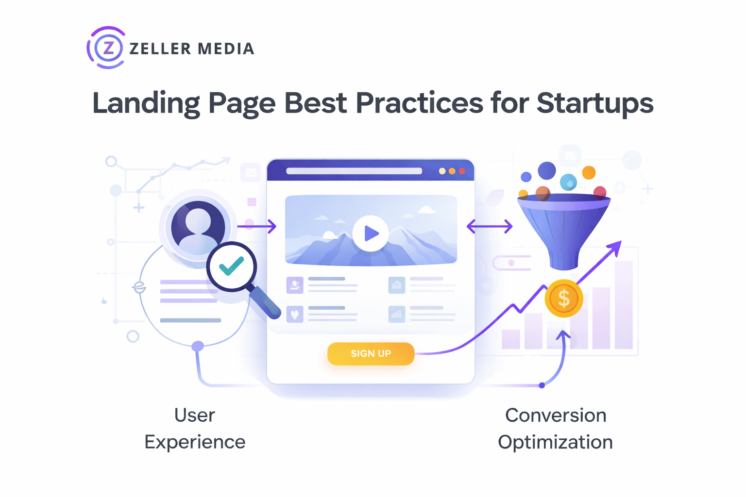
Once you understand your visitors' experience on your page, you can formulate a plan to ensure they see the value. There are many ways to improve the effectiveness of your landing page for any business from a startup to a established business.
1. Use compelling images
A good marketing strategy for startups is to have good images. They can make or break your landing page. People do not want to read lengthy descriptions of your product or service, and they want to see the benefits of the product and its value immediately. Quality images will create a better experience for your visitors and may encourage more conversions.
2. Name your landing page for a specific product
Any startup marketing agency will let you know that giving your landing page the same name as the product or service is essential. This will make it easier for your visitors to find what they are looking for and may lead to more conversions.
3. Limit the colors you use
Using too many colors on a landing page can be visually confusing, and you may find that your customers cannot differentiate between your products or services. Unless you are designing a specific product or service, stick with a limited color palette.
4. Use headlines to emphasize the value
Headlines are what immediately pull in your customers. They are also important because they help explain the copy on your landing page. Make sure your headlines appeal to your customers and establish value.
5. Use bullets to draw attention
Bullets effectively explain how a product or service is valuable, especially if it is time-sensitive or limited in availability. You can use bullets to draw attention to important parts of your copy or give visitors a clear path of what they need to do next.
6. Use short paragraphs
While long copies may help explain your product or service, most of your visitors will not read the entire page. Keep both your headlines and copy to a maximum of four sentences. Longer text may seem overwhelming and may discourage people from reading it. People are more willing to read short sentences that are easy to digest quickly.
7. Avoid distracting backgrounds
Keep your landing page simple and avoid colorful banners or animation on the page. Do not distract from the main message. Your landing page should have one purpose, to lead to a conversion.
8. Address all three fields of inquiry
Most visitors will have questions about your products or services, so you should lay out the most critical questions for them on your landing page. This will make it easy for them to complete an action such as giving you their email address, submitting a feature request, or buying a product. Include basic information about the product and what you need from visitors to complete their inquiry.
9. Include a call-to-action
A call-to-action, CTA, is what tells your visitors to do something after they have completed their inquiry. Your main goal is to get people to take action, and a CTA will help you direct them in the right direction. You can boost engagement by including multiple CTAs on your page, and using words such as submit or sign up now will encourage more conversions.
10. Use a clear and simple navigation
A landing page should be simple in format, without too many bullets or extra steps that may deter visitors from making a purchase. Keep your navigation simple, especially if your page is long. It will be easier for essential parts of your page to stand out since the page is more visually appealing.

In summary, landing pages have evolved to become a powerful resource for businesses to market their products or services. Creating these pages may require time, money, and effort, but the results are well worth the investment you make into your business. If you are still unsure what kind of landing page is best, think about your overall business goals, your target audience, and how you can streamline bringing in new customers. Get in touch with Zeller Media, a company that specializes in landing pages for paid search.


